

Im just going to jump right in with the score. Its an A. Maybe not an A+ because we haven’t seen them in action just yet but rest assure its an A. I hate literally EVERYONE saying they hate it for what ever reason they have. Look I dont hate the old logo, they just look so dated. Will be fun to wear that in like a throw back game or something, but make no mistake about it, those things look and belong in the 1990’s. I’ve said it in an earlier post, that they just screamed 90’s expansion team. All the people calling for the front office’s head asking to bring back the old leaping cat because its more intimidating need to get with the times. They just want hard hitting and loud brash logos. All of those things are all bark and bite but this isn’t a dog fight, its hockey. A game that’s now speed and possession driven with data to support right decisions. So lets address all the pros and cons one by one starting with the Cons just to shoot down all your silly notions.
CONS
1.) The Leaping Cat Was More Intimidating!

Of the 30 NHL clubs which logo can you actually say is intimidating? Panthers pre-last Thursday I guess you can say looks intimidating although you can argue that the cat is leaping to give you a hug. Other than that, Minnesota, Nashville, and San Jose I would say are the other 3 “most intimidating” logos. Minnesota is almost in 100% agreement that they were better as the North Stars. Nothing intimidating about the letter “N” and nothing intimidating about a forest scenery embedded in an animal skull. Nashville? I guess I would be afraid of a Saber tooth tiger if evolution and natural events didn’t wipe them off the face of the earth, but then again I would realize it has the largest over bite in the world and can’t actually eat me. So intimidation factor? 0%. San Jose Sharks? In the past few years they’ve been a bit of a Washington Capitals and blowing up from underneath when they look poised to win the Stanley Cup. They’re 1-3 now facing elimination on Friday for a chance to lose in their first Cup Finals. Congrats, but not intimidating. The fucking Penguins logo is a happy Skating Penguin and their about to claim another cup. So really intimidation logos can GTFO of my face. You know whats intimidating? Knowing guys like Ovi can fire a rocket from the top circle into the goal. That you can go up 3 nothing in the 3rd but guys like Toews, Crosby, Tavares can laugh that off and find a way to win. Thats what’s intimidating. The Red Wings have a tire with wings on it. Literally two of the most random object pairings a brain can think of and they’re still intimidating. Having the leaping cat as some type of intimidation factor is a joke when we’ve made the playoffs 5 times. That shit wasn’t intimidating no one.
Bonus Round Religious Intimidation Logo- NJ Devils. Not even the most god fearing nun is afraid of the devils right now.
2.) They Look Like International Jerseys! Like Finland or Czech or Russian Jerseys!
I guess people might have somewhat of a point here. I guess they do kinda look like Finland or Czech Olympic jerseys but you say that as if its a problem which it isn’t and if you disagree there are two guys I’d like you to meet that’ll change you’re mind.

Do you have something bad to say about international looking jerseys still? I think not.
P.s- I remember towards the end of last season I saw a beautiful European girl at the BB&T wearing a Suomi Barkov jersey and I nearly wanted to rip it right off her back. Yea it would’ve been sexual assault but but I also would need to make the mug shot of me desperately trying to squeeze into a Barkov Suomi jersey as my profile picture for all social media platforms.
3.) They Look Like Soccer Jerseys! Welcome To Panthers F.C.!

Google Soccer jerseys or Futbol “kits” and try to find me a jersey that looks like the new sweaters. Oh wait you can’t because these are two different sports with entirely different jersey types. Honestly its one of the more absurd comments I’ve heard. Now I assume when people say that they mean to say the logo itself looks like a soccer logo. Why? because its some shield or crest shape logo? If anything I’d argue that a shield/crest logo is the highest forms of logos. They command respect. No one has ever said “Oh man those Rangers home whites look terrible with their logo!” because they all know it would be lying. I also saw someone say that they remind them immediately of F.C. Dallas logo. Bro there’s no chance in hell you thought of some random MLS logo. Liars.
4.) Our New Logo Is Nala From The Lion King!
Uhh was this suppose to be a bad thing? Nala, that bitch was regal as fuck. Who is a man with out his woman to support him? Who is Simba with out Nala? A virgin ass lion who betrayed his land and cowered away from his position as the King because he was dumb enough to fall for evil uncle’s tricks. Oh and kind of a race trader for befriending a warthog and a meerkat, but its 2016 so that’s progressive. He shamed his father until Nala helped convince him to beat that asshole Scar up. Nala was the backbone to Simba and the main reason Pride Rock was Jumpin once Scar died. Not to mention everyone knows the female lions do most of the hunting.
P.s- If the Thrashers were still a thing it would be kinda funny if they had a logo redesign that looked like Zazu, mostly because Zazu is a funny name that makes me giggle.
5.) They Look Like The Jags New Logo!
![]()
Not gonna lie, this one hurts, but like the Jags, we’re both young teams compared to the rest of the league and filled with years of disappointment. Also like the Jags, I’m pretty sure they wanted to change to reflect dumping away the older years and bring in something modern with new personnel and try to win. For them it was Blake Bortles (UCF stand up) for us, it was Barkov, Huberdeau, Ekblad, Luongo, Jagr with Tallon heading it all and Gallant coaching the shit. So the difference is we should be showing them how to do it up.
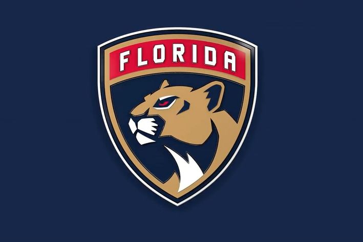
6.) It Looks Like A Cougar or Mountain lion, not a Panther!

Hey did you dummies flunk Biology? Cougars and mountain lions are the same! Cougars, Mountain Lions, and Panthers, even the Florida versions! Genus: Puma Species: P. Concolor. Did Vinnie Viola get it wrong? No. You guys just don’t understand Latin and the concept of taxonomy. It’s now a subspecies that is hardly even recognized by scientist so I don’t expect artist to make a rendering that provides distinct biological differences when scientist don’t even recognize differences. Not to mention with Vinnie Viola under the helm, be lucky he didn’t just change the name entirely to some branch of the Military because given the option I bet he would.
P.s- You see the rounded ears bit? This new logo is more anatomically correct than the old one.
PROS
That should cover all the complaints I’ve seen around the web. For all I know this might just be the vocal minority but either way i just squashed their silly opinions. On to the pro’s and just general changes.
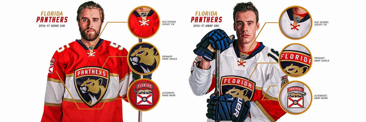
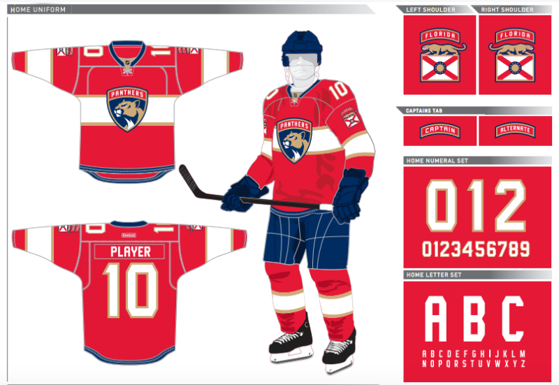
1.) Clean AF

This might just be because Ekblad is the team model and everyone knows Riley Smith crushes pussy but those are clean and sexy as fuck. Simple. Bold. Regal. It might be one thing to judge the logo itself on a plain navy blue background but those things on body and in motion look awesome. The red is so bright. The white I think will look clean on the ice. A touch of navy blue to make all the others pop and one thing I’ve never liked on the old jersey was the yellow. Just the word right now seems unappealing. “Yellow.” It reminds me of macaroni and cheese or some nacho cheese color and that was all over the old sweaters. This did away with that. Now legit Gold and the right amount to not over take the red or white. There’s less going on now. You can say the leaping cat looked more intimidating all you want but if you stare right into the eyes and mouth, something about it always looked robotic. This one looks noble and serious as should be the direction the team is moving towards.
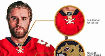
2.) Logo crest

A huge talk about the logo was that it was based on the 101 Airbourne division. Now obviously they’re shapped different but the other one would’ve looked too much like the Rangers logo. We’re talking strictly NHL, no team has a logo like this. And c’mon its based off of the Division that helped win WWII. South Florida should appreciate it along with the rest of Florida, the entire United States, Normandy France, and all the other allies in combat. If you don’t you’re kind of being a bit of a terrorist/nazi.
3.) Shoulder Logo

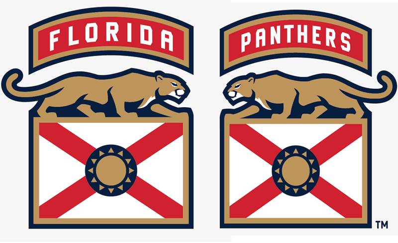
Now you could not find a bigger proponent of the old shoulder logo the cats were rocking than me. I loves the Palm tree and hockey stick. Loved it more than the main logo itself. It said everything that the North wanted. Sunshine and hockey. You think these millionaire athletes want to spend a majority of their time in the frigid north? Definitely not. There’s a reason why almost half of the license plates at BB&T at from Quebec when you go to a Panthers game. Do I miss it? Yes, absolutely but do I hate these new ones? Absolutely no. Technically when it comes to success there are 3 California teams that can boast about Palm trees and hockey, and winning hockey none the less. I like the homage to the old logo with the sun logo in the center. Aside from that though I like the state flag patch. Its a great touch. When you think of Florida you don’t think of the Tampa, You think of Miami and the south with beaches and stuff. Don’t even know if schools teach that seal to kids in places outside of the southern region. Central Florida is all Disney, Gainesville is Gators football, and Tallahassee is the place you hope to go to collect lottery winnings and until only recently, football. They’re all random parts. South Florida is what that flag represents (ignore St. Augustine) and once the wheels on the Lightning fall off, we should be the name people think of when you say Florida hockey.
4.) Captaincy Patch

Now i don’t know if they’re gonna do away with the “C.” If so that’ll be pretty big. But like the rest of the military theme, This kinda fits that. Its really different but I don’t hate it either. You know who else does something weird with the Captain’s C? The Red Wings. They want to be different and have it on a different side? Fine. We’re going to wear it on the sleeve like its a ranking in the military. Its more than a hockey game now. Its combat.
5.) Laces
Love laces. No idea why but the concept of laces on hockey sweaters just go together. Hated that we never had laces, but honestly I don’t know if they would’ve worked well with the other ones. Enjoy the red and white ones too, when the reds are crisscrossed they kinda have a Florida flag look. Do any other teams have that? No, we’re special so embrace that.
So there you have it. New sweaters, new team, new year. I get everyone missing the old jerseys but they’re gone and probably won’t come back. I don’t know how you can read all of this and still think the new look isn’t awesome. Combine that with what Vinnie was going for with the new look and it gets my blood flowing for the next season.
“The idea when we came into Florida and took responsibility for the stewardship of the franchise, was to start anew and create traditions that were unique to this new start,” Panthers Chairman, Owner & Governor Vincent Viola said. “I think the logo harkens to the vanguard of courage; the idea that you put a shield on the hockey uniform. It’s something to protect, but you also protect it. We wanted something that began a new tradition of winning and demonstrated courage and selfless dedication to a team pursuit of victory.”
Beautiful. I honestly think now more teams should try to strive to have a shield logo. The old look was attached to memories of losing and never getting far and teams just falling so far from the goal. This new one should usher in new memories of winning.
.
.
.
.
.
Need to have a sit down with Mr. Viola to discuss getting rid of Victor E. Rat. Hate that motherfucker and he’s a joke to keep around. I have you in my cross hairs

